This one was taken with an iPhone 5s in a darkened room in my house. I used two task lamps and misc junk in the background. I was doing a review on the Elcan SpecterOS4x.
This one was taken to show how the optic fit in front of an MBUS Pro rear sight and to also show the updated adjustable ARMS levers. Overall, I'm happy with most things about this photo. The one issue I have is that there is a black and white patch that is blurred and slightly visible behind the optic. It's of a skull and has the words "Never Say Die" on it (a reference to the Goonies). I think the black and white combo stands out too much from the otherwise brown tones of the background.

This is another from the same series, meant to be more of a "production" image. I used the same setup as before, with two task lamps, and a large sheet of white construction paper on the background. The photo was to show what the included ARD looks like while attached. I tried to hit the focus so that the serial number was just out of focus. When I ran it through Photoshop to do the white correction on the background, I think it makes the R<--->L markings on the windage adjustment pop too much, and draws attention away from what I was trying to focus on.

Lastly, I took this with an iPhone 6s in my back yard on an cloudy day. It is a shot of my 1942 CMP M1, and was meant to be a phone wallpaper. I think the green sling ended up being too distracting.

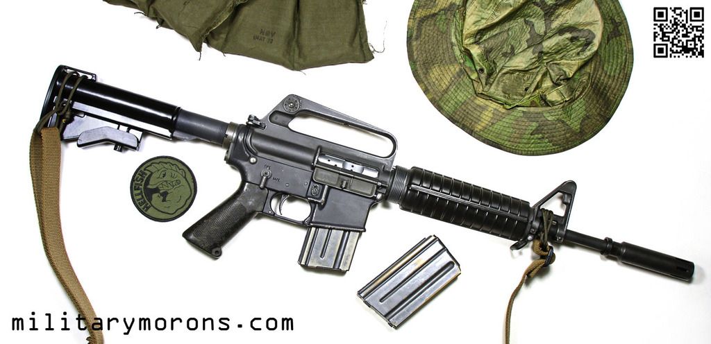
Here is the same day from a top angle. Background is my Vertx smock and misc patches. I used this one as a wallpaper on my computer for a long time. Biggest issue is that I couldn't get the whole rifle in the frame without also getting patches of the underlying grass, so I had to crop it tighter and lose some of the rifle.


 Reply With Quote


Bookmarks